
home decor ideas
Vastu Guide To Colour Combinations For A Small Kitchen

Different colour combinations used for a small kitchen can affect the energy and atmosphere of the space differently. And it’s essential to choose colours that will enhance the positive energy flow in the kitchen and your home.
If you follow the principles of Vastu Shastra, the Indian science of architecture, you can create positivity in your kitchen. This guide will provide you with the best colour combinations for a small kitchen as per Vastu. That too, with an emphasis on the right and wrong colours, and bonus tips for creating a balanced and energized kitchen space.
With the right colour choices, you can create a welcoming and relaxing kitchen that is both beautiful and functional.
Colours To Avoid
When it comes to choosing the perfect colour for your small kitchen, you must tread lightly and select your colours with the utmost care and consideration. After all, the colours you choose can have a profound impact on the ambience and energy of the space, just like a butterfly’s wings can cause a storm.
You should avoid certain kitchen colours as per Vastu because they have the power to bring the room to its knees and plunge it into a state of chaos and negativity. You should avoid dark and foreboding shades such as black and navy blue at all costs. Because they have the power to suck the light and joy out of the room, like a black hole. These colours can create a gloomy and oppressive atmosphere, making the space feel cramped and suffocating.
Similarly, you should avoid bright and harsh colours such as neon and fluorescent. Because they can be overwhelming and jarring, like a screeching bird in the morning. These may not blend well with colour combinations for a small kitchen and can make it difficult to relax and feel at ease in the kitchen.
Recommended Colours
When it comes to designing a small kitchen, colour plays a crucial role in creating a cohesive and visually pleasing space. As per the ancient Indian science of Vastu Shastra, some colours bring positive energy and balance to a small kitchen. Here are five recommended colours that will enhance the ambience and functionality of your small kitchen.
Green is a soothing and refreshing colour that can add a sense of tranquillity to a small kitchen. Light shades of moss, olive, seagrass, pale, or pistachio green help to attract positive energy and promote good health for the whole family. White is a timeless and versatile colour that can make a small kitchen feel more spacious and open. It’s a symbol of peace, serenity and success. This colour complements stainless steel appliances and can be used with wooden shades as an accent colour.
Cream/Beige are neutral shades that can create a sense of comfort and calm in a small kitchen. These colours are believed to balance the energies and keep the space looking fresh and inviting. Additionally, they can help create many colour combinations for a small kitchen. Wooden shades can add warmth and character to a kitchen. These colours are believed to represent strength, stability, and growth. Wood brown shades can be used in kitchen cabinets, dining table furniture, wooden utensils, and curtains/blinds.
Hints of red can add a touch of warmth and energy to a small kitchen. These colours are best used in small doses in the South-East-facing kitchen. But, it’s crucial to balance these colours with neutral shades. This is to avoid creating an aggressive atmosphere.
Ideally, you should consult a Vastu expert to tell you the precisely correct colours for your kitchen based on the direction it is in.
How To Make Colour Combinations For Small Kitchen
Are you ready to elevate the style and design of your small kitchen? Choosing the perfect hues is crucial in creating a cohesive and visually striking space. But how do you strike the ideal balance and avoid clashing colours? When selecting the ideal Vastu colours for your kitchen, it’s vital to consider the overall design and style of your entire home. Don’t let your kitchen stand out as an eyesore. Instead, aim for seamless integration and harmony.
Have you considered the direction of your kitchen and the corresponding element associated with it? Each direction of a space is associated with one of the five core elements. For example, the South-East belongs to the fire element and North-West belongs to the air element. By choosing colours that align with these elements, you can achieve balance and harmony in your kitchen.
One powerful example of a successful colour combination for a small kitchen that follows Vastu is using white as the main colour with wooden shades as the accent. This combination creates a bright, spacious and inviting atmosphere.
Another bold example is using earthy tones such as beige and cream with hints of green. This combination creates a sense of balance and stability while bringing a touch of nature into your space. It’s time for you to transform your kitchen into a space of balance and beauty.
Wrapping Up
When it comes to adorning your kitchen with the perfect hues, colours like white, cream/beige, green, wooden shades, and hints of red are like precious gems that align with Vastu principles. These colours when combined for small kitchens will help balance the energies of the five core elements. They are Fire, Water, Space, Earth and Air. Thus, creating a harmonious and positive ambience in the kitchen that nurtures health and growth like a blooming garden.
Don’t linger any longer! Get a quick and easy Vastu check online from experts. They will be your guiding light to not only choose the best colour combinations for your small kitchen but also find and fix other Vastu doshas.
With their expert guidance, you can turn your kitchen into a sanctuary of warmth, comfort, and nourishment for you and your loved ones, like a warm hug.

The Mueller Class Action Lawsuit has become a hot topic in the world of legal disputes, causing both conjecture and controversy. This article breaks down this legal drama into its component parts, explaining where it came from, who was involved, and how it has affected the law and public opinion.
Background
A thorough understanding of the Mueller Class Action Lawsuit requires knowledge of its origins. To set the stage for the accusations and the legal processes that followed, this part investigates what transpired prior to the lawsuit.
Legal Landscape
To understand the intricacies of the Mueller case, one must be able to navigate the complicated legal landscape. In this section, we explore the applicable legal systems, previous cases, and how they might affect the final decision.
Key Players
The people and organisations involved are the backbone of any courtroom play. Learn who shaped the storyline of the Mueller class action lawsuit and how they were involved.
Allegations
Analysing the charges against Mueller in great detail is where the meat of the issue is. In an effort to present a full picture of the case, this part analyses the accusations.
Mueller’s Response
Mueller, like any other court struggle, has his supporters and his detractors. In light of the accusations, review Mueller’s formal remarks and rebuttals.
Class Certification
To appreciate the extent and possible repercussions of the action, it is crucial to understand the procedure and significance of class certification.
Progress Timeline
Follow the development of the Mueller class action lawsuit in chronological order. Keep tabs on the turning points and changes that have moulded the case during its evolution.
Public Perception
An important part of the impact of the litigation is how the public views it. Find out how people feel and what influences them.
Impact on Businesses
Corporate organisations are not the only ones affected by the Mueller case. Determine how various sectors and companies might be affected.
Regulatory Impact
Investigate how the Mueller Class Action Lawsuit may influence future legal landscapes by influencing regulation changes.
Legal Ramifications
Consequences in the Law Every case that goes to court has repercussions. Look at what may happen legally to Mueller and how it could affect other instances like this.
Notable Legal Points
Investigate the major legal issues and arguments that have arisen as a result of the Mueller Class Action Lawsuit.
Media Coverage
When it comes to moulding public opinion, the media is indispensable. Investigate any potential biases in the media’s coverage of the litigation.
Case Precedents
You may learn a lot by looking at other class action cases that were comparable. Similar cases and their results are examined in this section.
Future Implications
Think about what may happen next with Mueller and situations like these. Determine the larger effect on judicial processes and any possible precedents.
Expert Opinions
We can learn more about the Mueller Class Action Lawsuit after consulting with analysts and legal professionals. Inquire about their thoughts and feelings on the matter.
Conclusion
In this part, we will review the Mueller Class Action Lawsuit in brief, outlining the main arguments and providing some insight into its intricacies and possible results.
FAQs
What initiated the lawsuit?
Adipiscing elit, lorem sit amet dolor, consectetur adipiscing eu.
How does class certification work?
A vital part of the legal procedure is class certification.
What are the specific allegations against Mueller?
There is a wide range of accusations levelled against Mueller, including…
What is Mueller’s defense strategy?
As far as Mueller’s defence is concerned, it centres on…
How has the public reacted to the lawsuit?
The general public’s response to the class action lawsuit filed by Mueller has been…
What could be the potential outcomes of the case?
Although forecasts are based on conjecture, possible results…

It’s easy to ignore the value of Sensitive Boy Chapter 1 in a culture that prizes toughness and perseverance. Sensitivity is a sign of emotional maturity and empathy, not a lack thereof. In this first installment of a multipart series, we will delve into the depths of a fantastic novel named “Sensitive Boy” and begin our adventure. We’ll start with Chapter 1 and dissect the story’s unique emotional depth and compelling characters to see what makes this book so special.
Who Is the Sensitive Boy?
Let’s become acquainted with the “Sensitive Boy” before we go into Chapter 1. The story revolves on this fascinating protagonist, who views the world through the eyes of a very sensitive person. The story of Sensitive Boy’s life is a reflection of the complex range of feelings and experiences that sensitive individuals have.
The Journey Begins
As we set off on this literary adventure, we find ourselves in a world where feelings are everything. We are thrust into a world of raw emotions, emotional conflict, and a thorough investigation of human sensibility in Chapter 1.
A Glimpse into Chapter 1
The first chapter is a riveting introduction that sets the tone for the reader’s emotional journey. To everyone who has ever felt the full force of their emotions, the opening depiction of the protagonist’s inner world will ring true.
Exploring the Characters
The characters in “Sensitive Boy” all have significant roles to play in the protagonist’s development. We’ll look into their connections and how they affect our sensitive protagonist.
Themes and Motifs
Already in the first chapter, a number of recurring ideas and images help to flesh out the plot. Central to the narrative are ideas of sympathy, personal growth, and making one’s way in an often unforgiving world.
The Significance of Sensitivity
Sensitivity is explored at length in Chapter 1, with the benefits of self-awareness and empathy for others emphasised. It runs counter to the common belief that vulnerability comes from being too sensitive.
The Impact on Society
In this chapter, we also discuss how society treats those who are very sensitive. It asks important concerns about the values we uphold as a society and the pressures that sensitive individuals confront in a world that isn’t always accepting.
The Author’s Craft
Chapter 1 cannot be discussed without praising the author’s masterful command of the written word. The author has an amazing way with words, transporting readers to the setting and making them feel the protagonist’s feelings with him or her.
Readers’ Perspective
Readers will be in deep thought after finishing Chapter 1. It helps readers think on their own experiences and develop empathy for the protagonist’s plight. The author’s skill is on full display in his or her ability to make readers feel this way.
The Emotional Rollercoaster
In the first chapter of “The Emotional Rollercoaster,” your feelings will swing wildly. Anyone who has ever struggled with their emotions will find common ground in the protagonist’s ups and downs, dramatic moments of self-discovery, and trials.
Critical Acclaim
The literary community has taken note of this section. Readers and critics alike have lauded “Sensitive Boy” for its masterful narrative, well-rounded characters, and striking portrayal of human emotion.
Sensitive Boy in Popular Culture
This is only the beginning of a trip that will go far beyond the pages of any book. The film “Sensitive Boy” has become a cultural classic, prompting conversations and increasing our collective comprehension of the need of being sensitive.
Conclusion
In conclusion, “Sensitive Boy” Chapter 1 is a literary jewel that profoundly explores sensitivity and captivates the reader. A must-read for people who value the exquisiteness of feeling, it challenges preconceptions and inspires empathy.
FAQs
1. Where can I read “Sensitive Boy”?
You may get a copy of “Sensitive Boy” from any book store, online bookseller, or even the library.
2. Who is the author of “Sensitive Boy”?
The author’s real name is well-known in the literary community, but for privacy considerations, the book is typically given a different author’s name.
3. Is “Sensitive Boy” part of a series?
A series, “Sensitive Boy” does indeed provide a fresh take on the main character’s development with each installment.
4. What age group is “Sensitive Boy” suitable for?
The novel delves into heavy feelings and ideas, so it’s best left in the hands of more experienced readers.
5. Can I connect with other fans of “Sensitive Boy” online?
Certainly! On many online discussion boards and social media sites, you may discover groups of readers discussing and debating the book.
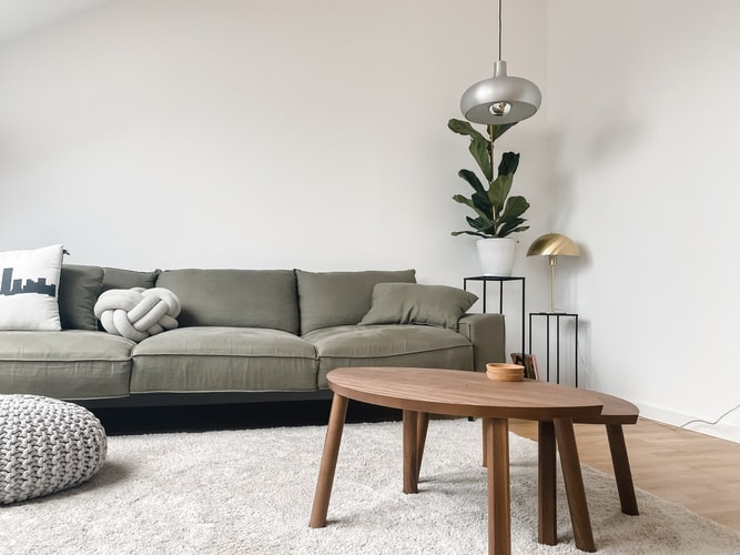
Your living room plays a huge role in making your house vibrant and welcoming. If it has the right pieces of furniture, you can expect that your guests and loved ones will enjoy spending their time in the said room. It is also possible that you and your family will use the place more often to bond together, watch movies, play games, and entertain visitors. Moreover, it tends to be the heart of the home if it has precious photos and beautiful decorations.
Are you having difficulty in making your living room a compelling place to stay in? Is it a boring and monotone space that does not inspire you to take photos? Well, if you answered yes to both questions, it is time to update its look by redecorating. If you don’t know how to revamp the place, you might want to take a look at Scandinavian design as a source of inspiration for your interior design.

What is a Scandinavian design?
A Scandinavian design values simplicity, functionality, and minimalism more than anything else. There are now numerous Scandinavian furniture, textiles, ceramics, lamps, and glass manufactured in the market. This design movement originally started in the early 20th century and became very popular in the 1950s, especially in five Nordic countries, namely Denmark, Finland, Sweden, Norway, and Iceland. Nowadays, it is still the leading design used by many homeowners. Keep reading to know the notable characteristics and principles of the movement.
-
Use of natural lighting
With quarantine restrictions in place, you probably spend most of your days indoors to lessen the threat of becoming infected with the virus. There are days that you might feel isolated and lonely. And having a dark living room will not help as it can make you feel more alone than you ever were. To avoid feeling this way, you might want to incorporate Scandinavian design in the place. It is a type of movement characterized by the use of white walls to emphasize available light. To add to this, it avoids using a lot of window treatments so that light can illuminate spaces. Aside from inducing a more positive environment, natural light can also make the place appear bigger and brighter.
-
Use colors seen in nature
Most houses with Scandinavian interior design utilize all-white walls and windows because they aspire to achieve a perfect whitewashed look. If you are not a fan of this color, there are also other options that you can choose from. Since it is a popular movement that uses shades found in forests and landscapes, you can use amber, moss green, and rust colors. You may also add plants and other greenery decorations to add more texture and life to the living room. Besides that, botanicals, such as flowers, can brighten up the whole space and contribute to the natural and minimalist essence of Scandinavian design.
-
Characterized by simplicity and practicality
The two principles that Scandinavian design upholds at all times are simplicity and practicality. When you see a house with this kind of design, you will notice that its wall does not have a lot of decorations. It is because homeowners tend to leave it as bare as possible to emphasize the mentioned principles. Besides that, all the pieces of furniture placed in the space are functional and valuable.
-
Uses wood accents
Aside from using colors seen from nature, the design also requires the use of wood accents. You can incorporate it into your floors and slats. In addition, You can use any decorations made from this material and place them on your wall. For instance, you can use wooden toys in the room to serve as playful accents. To not move away from the light and bright aesthetics of Scandinavian design, you may use light woods, such as pine, beech, and ash.
Ways to achieve a Scandinavian design in your living room
Designing a living room is a crucial task to do because one wrong decision can make or break the entire vibe and mood of your home. Even if you already know the characteristics and principles of Scandinavian design, it might still be hard for you to incorporate it into your own home. So below is a list of ways on how you can add a minimalist aesthetic in the place.
-
Make the place clean and functional
If the Scandinavian design is your inspiration in upgrading your living room, you have to make sure that the place is always free from any clutter. In terms of decorations and pieces of furniture, only those that are functional should be put in the place. So make sure that you remove unwanted items. Don’t forget to use straight lines to maintain the simplicity of the place. Purchase only minimal yet modern furniture and add cozy elements such as area rugs and throw blankets
-
Buy a sofa and table with a modern design
The sofa that you must buy for your living room must have a modern style to match the Scandinavian design. It must be slim but still comfortable to avoid consuming a large amount of space. As mentioned earlier, this design movement uses wood accents so a wooden couch is also a great idea. To provide utmost comfort, pair it with throw pillows in muted colors. In terms of the living room table, the most recommended is the one with light-colored wood.
-
Buy pendant lighting
Instead of using chandeliers, you can buy pendant lighting to complement the Scandinavian aesthetic. This type of light fixture can create the place brighter without appearing out of place. It works well with pieces of furniture made from wooden materials. You might want to check out the lamps introduced by Danish architect Poul Henngninsen in the 1920s, such as the PH lamp, Snowball lamp, and Artichoke lamp. By researching them, you can have a better idea of what type of light you should purchase.
In a Nutshell
Scandinavian interior design remains trendy nowadays. There is no possibility that it will go out of style sometime in the future. It is because it satisfies the desire of every homeowner for a tidy, inviting, and comfortable living room. Visit Storables.com to know the different online stores where you can buy Scandinavian furniture!
-

 Social Media10 months ago
Who is Rouba Saadeh?
-

 Apps10 months ago
Why is Everyone Talking About Hindi Keyboards?
-

 Social Media10 months ago
Mati Marroni Instagram Wiki (Model’s Age, Net Worth, Body Measurements, Marriage)
-

 Entertainment10 months ago
12 Online Streaming Sites that Serve as Best Alternatives to CouchTuner
-

 Apps10 months ago
Things you need to know about Marathi keyboard today
-

 Apps10 months ago
Stuck with Your default Bangla keyboard? Isn’t it time for a change?
-

 Entertainment10 months ago
Movierulz Website: Movierulzz 2021 Latest Movies on Movierulz.com
-

 Social Media10 months ago
Brooke Daniells: Everything About Catherine Bell’s Partner